Data Visualization with Matplotlib#
Visualization is an essential element in data science. It helps to get a first impression of the data and of relations within the data. It also serves to communicate the results with others. Actually, good figures are one of the most important factors for a successful publication.
Matplotlib#
The most common visualization module in python is Matplotlib. There are also excellent alternatives, such as Plotly or Bokeh, and packages that make use of the basic plotting libraries to easily create specialized plots (e.g. Seaborn or Holoviews), but the discussion here is limited to Matplotlib.
First, we have to import matplotlib. Matplotlib offers several APIs for plotting, and the one designed for easy interactive data analysis is pyplot.
It is available as a module of the matplotlib package.
import matplotlib.pyplot as plt
Anatomy of a figure#
Lets create our first figure:
# Prepare the data
x = [0, 1, 2, 3, 4, 5, 6]
y = [-2, 0, 2, 4, 6, 8, 10]
y2 = [0, 1, 4, 9, 16, 25, 36]

# Plot the data
plt.plot(x, y, label='linear')
plt.plot(x, y2, label='quadtratic', marker='o')

# Add a legend
plt.legend();
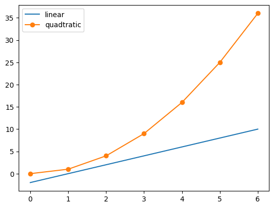
In this example, we unconsciously used a lot of built-in default settings, which takes care of all the necessary components to create a meaningful figure. To understand the logic of matplotlib, it is necessary to have a look at the anatomy of a figure:

The two most important components are:
Figure: the whole area (window, page, etc.) on which we plot. It is the basis for all elements on which we will focus on in the following. It is possible to create multiple independent figure instances and a figure can contain multiple objects.Axes: the area on which data is plotted with functions likeplot()orscatter(). It may contain coordinate axes withlabelsandticks. One figure can hold multiple axis, so-called subplots.
Additionally to these fundamental components, a wide variety of components can be drawn. Every axis has a x-axis and a y-axis, which both have ticks (major and minor tick lines and tick labels). There are also axis labels, a title, a legend and a grid to customize the plot. Spines are the lines, which connect the tick lines and separate the plotting area from the rest.
Creating Figures#
There are two possible ways of managing the content of a figure, the object oriented and the state machine way.
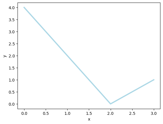
Object-oriented way#
When using the object oriented way, the figure object is created explicitly.
Then we create an axis object for that figure using the add_subplot method of the figure object.
Finally, we can draw graphs on this axis object and customize the plots using methods of the axis object.
fig = plt.figure()

ax = fig.add_subplot(111)

ax.plot([0, 1, 2, 3], [4, 2, 0, 1], color='lightblue', linewidth=3)

ax.set_xlabel("x")
ax.set_ylabel("y");
State-machine way#
With the state machine API, we only use module functions to do the drawing and the customization. By default, a figure object and an axis object is created automatically. If multiple axes are used, the function always act on the last created axis. Hence, the order of the instructions does matter and their meaning depend on the state of the plot. The code below is perfectly equivalent to the example above.
plt.plot([0, 1, 2, 3], [4, 2, 0, 1], color='lightblue', linewidth=3)

plt.xlabel("x")
plt.ylabel("y");
As one can see, plt.xlabel is equivalent to ax.set_xlabel.
Actually all methods of an axes object are also implemented as functions of the pyplot module with a slightly different name (the set_ is omitted).
Hence, using the state machine interface keeps the code clear for simple plots.
When the figure becomes more complicated, e.g. with many different subplots, it is usually better to use axis objects and the object oriented API.
This produces a better readable and more explicit code.
To get accustomed to the possible options, the best approach is to have a look at the matplotlib gallery and to learn from the given examples.
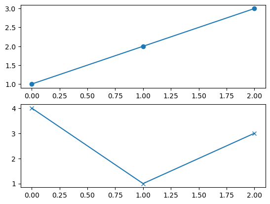
Creating multi-panel plots#
Figures can have multiple subplots which in turn can be arranged differently.
To create a figure with multiple sub plots, we can use the plt.subplots() function:
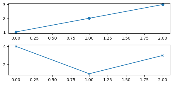
fig, ax = plt.subplots(2, 1)

ax[0].plot([1, 2, 3], marker="o")
ax[1].plot([4, 1, 3], marker="x")
[<matplotlib.lines.Line2D at 0x114d50190>]
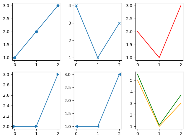
fig, ax = plt.subplots(2, 3)

ax[0][0].plot([1, 2, 3], marker="o")
ax[0][1].plot([4, 1, 3], marker="x")
ax[0][2].plot([2, 1, 3], color="red")

ax[1][0].plot([2, 2, 3], marker=">")
ax[1][1].plot([1, 1, 3], marker="<")
ax[1][2].plot([5, 1, 3], color="orange")
ax[1][2].plot([5.5, 1.1, 3.7], color="green")

fig.tight_layout();
ax is a 1D or 2D array, which contains all axes objects.
When we use many subplots on a figure, the axis elements that are located outside of the spines, e.g. axis labels or colorbars, might interfere with neighboring subplots.
This can be fixed by appending the command fig.tight_layout() at the end of the plot creation.
Often, we need a different aspect ratio for the figure. Or the label font size is too small or too large for the medium for which the figure is created.
Then, we want to change the figure size. It can be set with the argument figsize=(width, height) when the figure object is created.
The figure size is given in units of inches. Hence, you can change the relative font size of all text on the slide by resizing the figure without changing the aspect ratio.
fig, ax = plt.subplots(2, 1, figsize=(6, 3))

ax[0].plot([1, 2, 3], marker="o")
ax[1].plot([4, 1, 3], marker="x")

fig.tight_layout();
Outlook on more advanced functionality#
Plotting routines#
The actual visualization of data is done by the various plotting methods of the axes object. Here are some examples:
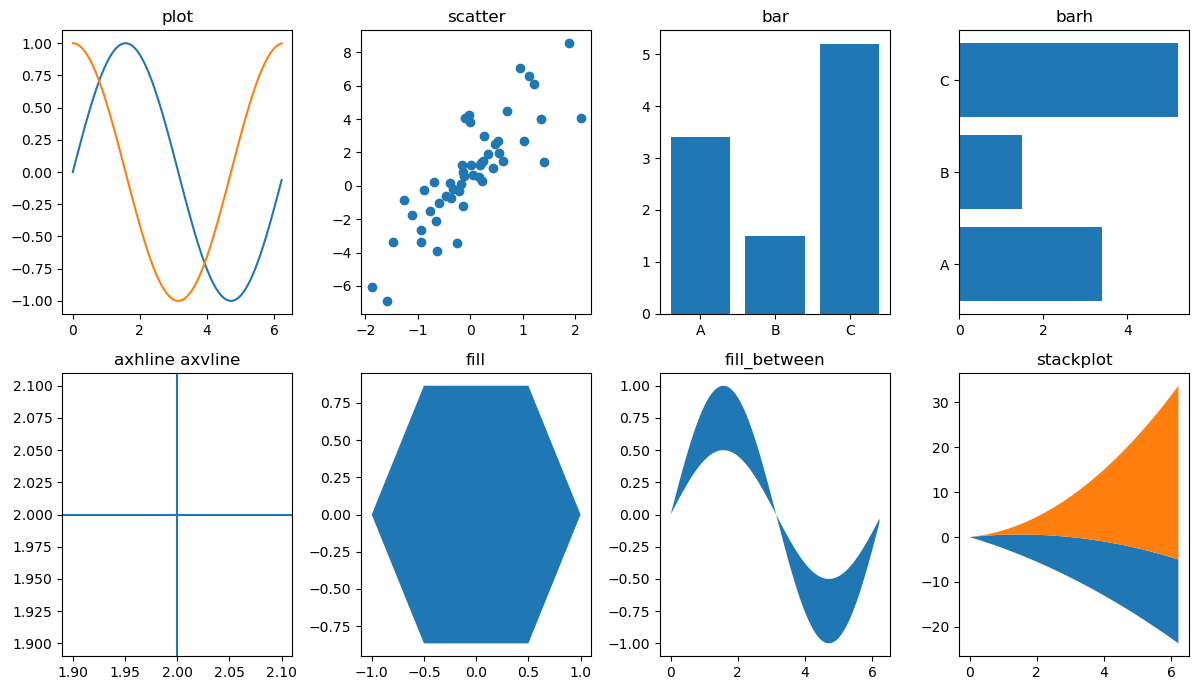
1D data#
Methode |
Description |
|---|---|
Line plot |
|
Scatter plot |
|
Vertical rectangles |
|
Horizontal rectangles |
|
Horizontal line across axes |
|
Vertical line across axes |
|
Filled polygons |
|
Fill between y-values and 0 |
|
Stack plot |
import numpy as np

plt.figure(figsize=(12, 7))

plt.subplot(241)
x = 2*np.pi * np.arange(0, 1., .01)
plt.plot(x, np.sin(x))
plt.plot(x, np.cos(x))
plt.title("plot")

plt.subplot(242)
x = np.random.randn(50)
y = 3 * x + 1 + 2. * np.random.randn(len(x))
plt.scatter(x, y)
plt.title("scatter")

plt.subplot(243)
plt.bar([1, 2, 3], [3.4, 1.5, 5.2], tick_label=["A", "B", "C"])
plt.title("bar")

plt.subplot(244)
plt.barh([1, 2, 3], [3.4, 1.5, 5.2], tick_label=["A", "B", "C"])
plt.title("barh")

plt.subplot(245)
plt.axhline(2)
plt.axvline(2.0)
plt.title('axhline axvline')

plt.subplot(246)
x = np.cos(2*np.pi * np.arange(0, 1., 1 / 6.))
y = np.sin(2*np.pi * np.arange(0, 1., 1 / 6.))
plt.fill(x, y)
plt.title('fill')

plt.subplot(247)
x = 2*np.pi * np.arange(0, 1., .01)
plt.fill_between(x, np.sin(x), .5 * np.sin(x))
plt.title("fill_between")

plt.subplot(248)
x = 2 * np.pi * np.arange(0, 1., .01)
plt.stackplot(x, 3 * x, x**2, baseline='wiggle')
plt.title("stackplot")

plt.tight_layout()
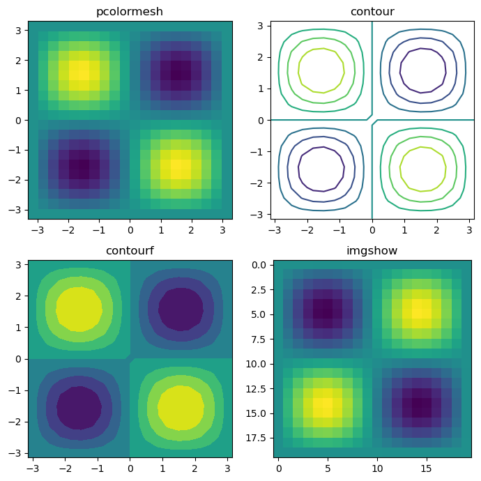
2D data#
Methode |
Description |
|---|---|
Pseudocolor plot |
|
contour plot |
|
Filled contour plot |
|
Show image |
x = np.linspace(-np.pi, np.pi, 20)
y = np.linspace(-np.pi, np.pi, 20)
c = np.sin(x) * np.cos(y + np.pi / 2)[:, np.newaxis]

plt.figure(figsize=(7, 7))

plt.subplot(221); plt.pcolormesh(x, y, c); plt.title('pcolormesh')
plt.subplot(222); plt.contour(x, y, c); plt.title('contour')
plt.subplot(223); plt.contourf(x, y, c); plt.title('contourf')
plt.subplot(224); plt.imshow(c); plt.title('imgshow');

plt.tight_layout()
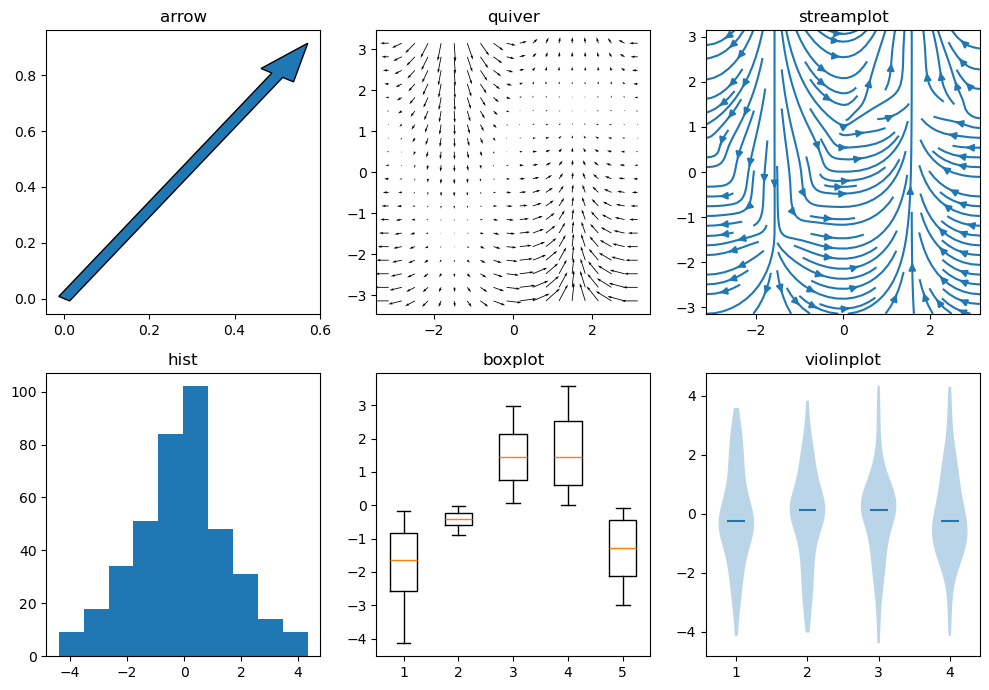
Distributions and vector data#
Methode |
Description |
|---|---|
Arrow |
|
2D field of arrows |
|
2D vector fields |
|
Histogram |
|
Boxplot |
|
Violinplot |
x = np.linspace(-np.pi, np.pi, 20)
y = np.linspace(-np.pi, np.pi, 20)
u = np.cos(x) * np.abs(y[:, np.newaxis] - np.pi / 2 * np.sin(x) - 1)
v = np.sin(x) * np.abs(y[:, np.newaxis] - np.pi / 2 * np.sin(x))

plt.figure(figsize=(10, 7))

plt.subplot(2, 3, 1); plt.arrow(0, 0, .5, .8, width=.03); plt.title('arrow')
plt.subplot(2, 3, 2); plt.quiver(x, y, u, v); plt.title('quiver')
plt.subplot(2, 3, 3); plt.streamplot(x, y, u, v); plt.title('streamplot')
plt.subplot(2, 3, 4); plt.hist(u.flatten()); plt.title('hist')
plt.subplot(2, 3, 5); plt.boxplot(u[:, ::4]); plt.title('boxplot')
plt.subplot(2, 3, 6); plt.violinplot(u.reshape(-1, 4), showextrema=False, showmedians=True); plt.title('violinplot');

plt.tight_layout();
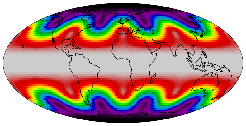
Maps#
We need an additional package to plot proper map projections. Cartopy is suggested. We have to choose a map projection which defines how the 3D surface of the Earth is projected onto a 2D surface for plotting. The projection used below is the Mollweide projection.
def sample_data(shape=(73, 145)):
    """Return ``lons``, ``lats`` and ``data`` of some fake data."""
    nlats, nlons = shape
    lats = np.linspace(-np.pi / 2, np.pi / 2, nlats)
    lons = np.linspace(0, 2 * np.pi, nlons)
    lons, lats = np.meshgrid(lons, lats)
    wave = 0.75 * (np.sin(2 * lats) ** 8) * np.cos(4 * lons)
    mean = 0.5 * np.cos(2 * lats) * ((np.sin(2 * lats)) ** 2 + 2)

    lats = np.rad2deg(lats)
    lons = np.rad2deg(lons)
    data = wave + mean

    return lons, lats, data
import cartopy.crs as ccrs


fig = plt.figure(figsize=(10, 5))
ax = fig.add_subplot(1, 1, 1, projection=ccrs.Mollweide())

lons, lats, data = sample_data()

ax.contourf(lons, lats, data,
            transform=ccrs.PlateCarree(),
            cmap='nipy_spectral')
ax.coastlines()
ax.set_global()

By passing a projection object from the cartopy.crs module as the projection argument in the fig.add_subplot call, the projection of the map plot is set.
However, we also have to specify in which coordinate system the coordinates of our data are defined to enable cartopy to transform between different coordinate systems.
This is done by passing a projection object as the transform argument in the plotting call. By knowing the correct transform for our data, we can choose any map projection we like.
Of course these are not all functions. Have a look in the matplotlib gallery for more examples.
Customize figures#
To obtain a meaningful and acceptable figure, further information such as axis labels, subplot titles or possible annotations (to emphasize certain aspects of the figure) have to be added. All subplot specific settings are implemented as a property of the axes object and can be set with ax.set(). Here is an incomplete list of available properties.
Property |
Type |
Description |
|---|---|---|
alpha |
float |
Transparence, between 0 und 1 |
aspect |
{‘auto’, ‘equal’} or num |
Ratio of the axis scales |
facecolor |
color |
Background color |
frame_on |
bool |
Frame around the data section |
position |
[left, bottom, width, height] or Bbox |
Position of the axis in the figure |
rasterized |
bool or None |
Forces bitmap output for vector graphic formats |
title |
str |
Title of the subplots |
xlabel |
str |
Lable of the x-axis |
xlim |
(left: float, right: float) |
Data range of the x-axis |
xscale |
{“linear”, “log”, “symlog”, “logit”, …} |
Scaling of the x-axis |
xticklabels |
List[str] |
Tick labels |
xticks |
list |
Position of the ticks |
ylabel |
str |
Lable of the y-axis |
ylim |
(bottom: float, top: float) |
Data range of the y-xis |
yscale |
{“linear”, “log”, “symlog”, “logit”, …} |
Scaling of the y-axis |
yticklabels |
List[str] |
Tick labels |
yticks |
list |
Position of the ticks |
Those attributes can be set via ax.set() or e.g. via ax.set_xlabel() or plt.xlabel(). All lines below are equivalent.
ax.set(xlabel="x axis label")
ax.set_xlabel("x axis label")
plt.xlabel("x axis label")
Saving figures#
To use the figure in a talk or a publication, it needs to be saved first. Therefore matplotlib offers the command plt.savefig() or the savefig method of the figure object. The filename is given as an argument. The suffix determines the file format, e.g. png, jpg or svg. The latter is a format for vector graphics. When a bitmap is created, the argument dpi can be added.
fig = plt.figure(figsize=(10, 5))
ax = fig.add_subplot(1, 1, 1, projection=ccrs.Mollweide())

lons, lats, data = sample_data()

ax.pcolormesh(lons, lats, data,
            transform=ccrs.PlateCarree(),
            cmap='nipy_spectral',
            rasterized=True
)
ax.coastlines()
ax.set_global()

fig.savefig('for_web.png', dpi=72)
fig.savefig('for_publication.png', dpi=300)
fig.savefig('vector.svg')
Figures for publications
In general it is advisable to produce vector graphics for publications or presentations. Unfortunately they can get very big if the visualization of the data has a lot of structure, i.e. consists of many objects. This can be the case for scatter plots with many data points or pcolormesh plots of large arrays. The consequences are huge figure files and slow to render figures. If you plot data of considerable size you should pass the argument rasterized=True in the plotting command, e.g. ax.scatter() or ax.pcolormesh(). Labels and titles remain vector graphics while the graphical representation of the data itself will be rendered as a bitmap and embedded into the vector graphic. This saves a lot of memory, disk space and ensures that the final figure can be displayed smoothly. The resolution of the embedded bitmap can be specified by the dpi argument in the savefig call.